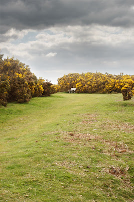
This again is a two staged exercise challenging the dynamic range of the camera and learning how to merge either two exposures of the same image (taken within seconds) into a single image or by replacing part of an image that may be overexposed with another image
For the first part I took two images of a scene on a tripod so that the images would be exactly the same, but altering the exposure (shutter speed) so that the first image has the foreground perfectly exposed (1/5 sec) and the second the sky perfectly exposed (1/80 sec) both images were taken at f13 so that the depth of field remained constant.
Not surprisingly the dynamic range of the camera is well surpassed and either the sky is completely burnt out or the foreground too underexposed.
Using Photoshop I copied the darker image onto a new layer on the foreground exposure and applied a standard mask. The notes suggest using the eraser tool to remove under exposed parts to reveal the foreground exposure underneath, and while this is a good way to do things I prefer to use masks as they are non-destructive; any errors can simply be altered by painting in either black (hide) or white (show) with varying brush opacities to blend in the two images.
So I first added a gradient from white to back (top to bottom) in the mask, this revealed an almost perfect image with no selection or erasing. As the horizon in my image is not flat this left some of the bushes too dark, this came from the darker exposure of the sky. By selecting a soft brush with an opacity of 20 I painted over these areas so that they blended in to produce the following composite image. I feel that this has worked well and any join is invisible due to the blend of the mask as seen from the layers menu above.
The second task is to replace the sky completely with a second image from a different scene. I used the same landscape image but this time replacing the sky with the following image. I chose this image of the 'sky' as the sun was shining from the left to the right as it is in the original landscape.
I used a similar method as before using a layer mask to blend in the new image into the existing image to produce the following. Whilst I think that this is acceptable and not much to compare with from the first image composition I feel that this one is not quite as believable.


No comments:
Post a Comment