Tuesday, 25 October 2011

Exercise: Colour cast and white balance

In this exercise we are exploring the varying colour temperatures given off by the sun in different circumstances such as time of the day, clouds, shade, sunshine and the interaction with artificial lighting. A key point I want to note is that although temperature increases with heat (degrees kelvin) the 'colour cast or colour temperature' of blue (around 10,000k) is a higher temperature that that of a setting red sun (3000k), and white light (12 mid day in sunshine) being somewhere in between the two at 5500k. An interesting comparison made in the notes was certain elements as they increase in temperature turn from red to white to blue.

We are to find scenes in sunlight, shade on a sunny day and cloud and take four images of each with the camera set for white balance settings of auto, sunlight, shade and cloud noting the difference.

The first set of four images were taken on a cloudy day.

 
I chose these coloured pegs as I thought varying settings would make a difference but there is very little. If anything the Cloudy setting is less intense and therefore probably more true  in terms of colour but I like the brighter more intense colours of the Shade WB.

The next set were of those in sunlight, taken at around 11 am in early Autumn.

 
Again the relevant setting seems to be more accurate, that is the daylight setting, or sunlight setting does not have a red'ish cast compared to the others, albeit warming up the scene nicely. As it can be seen although the sun was shining there were clouds about and the Cloudy setting has also worked reasonably well, perhaps better than the Auto setting.

The final set were taken on a sunny day in the Shade or part shade. Here there are seen more dramatic differences.


The Auto setting definitely has a blue cast to it and is not the best version by far. I was surprised to see that the Shade version has tried to compensate for the Blue Cast but warming up the image, but a little too much, almost as it it were in sunshine itself. The Cloudy WB probably reflects the most accurate and pleasing image here.

The second part of this exercise is to take three images using a white balance of auto, sunlight and tungsten at dusk where both the inside and outside are visible with the interior lit by incandescent (tungsten) lighting. This required a tripod as the shutter speeds were around 1/4 second.


The daylight setting certainly has warmed up this image, a little too much though. The auto setting has too warmed up  the image but not quite as much. The tungsten setting has good neutral inside tones but at the cost of producing a blue cast to the outside particularly on the edge of the panes of glass.

Finally we are asked if using RAW to look at adjusting the white balance sliders to see if there is a compromise. If found that by adjusting the temperature from 3150 to 3400 and the tint from +4 to -12 gave the best results. This would warm up the image and increase the green of the background foliage respectively.


Monday, 24 October 2011

Exercise: Your camera's dynamic range

This was an interesting exercise to determine the dynamic range of our camera, mine is a Canon EOS 40D. To measure the range we are to set up a scene in sunlight with a piece of white card to provide the highest relfectance and hence the highest highlight. The scene should also have a dark area  with detail, I chose a summerhouse in sunlight where the windows were almost black but able to see some detail, I used a piece of A3 card and placed it in both shade and direct sunlight.

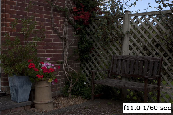
With the camera set at 1/800 exposure at ISO 100 with all noise reduction off, I found that an aperture of f/4.5 just prevented the camera's clipping warning on the white card, signifying the brightest part of the scene. This image is shown below.


We were then asked to measure the brightest part of the image and two or three dark parts. I changed the metering of the camera to spot and zoomed into the card which measured f/11. The lowest part of the image I measured was f/4, this however was also on the limit of the lens I was using but seemed to be a good reading.

With the image open in Photoshop I used the colour sampling tool to measure the RGB channels on the card, these were almost at the maximum with typical readings on all channels in the 25x range showing that there was no burn out in the image and it was indeed exposed as best as possible.

To find the lowest exposure capable of the camera I opened the image in RAW and turned off any noise reduction and zoomed into the darkest part of the image. Adjusting the exposure slider so that the dark areas were lightened until the level of noise introduced could not be distinguished from the detail. Here is a snapshot of that scene. The noise introduced on the wood is not not distinguishable with the detail.


This adjustment gave a further 3.5 stops. This only gave my camera a total dynamic range of 6.5 stops, reading online literature it is actually around 8.5 stops, but I think that although this exercise shows how to judge the dynamic range it is probably not as accurate as the testing methods I have reviewed. If time permits I will repeat this again with a lens that has a lower f-stop, I think that is probably where I lost a couple!

Monday, 10 October 2011

Exercise: Sensor linear capture

This was an interesting exercise to see how light that falls on the camera's sensor is processed within the camera. Light is treated linear for the camera's sensor and most of the captured light is towards the the left of a histogram in the dark areas. To compensate for this the camera applies a gamma correction to boost the highlights and mid tones, effectively shifting the histogram to the right. This gives an image which is close to what the human eye would have seen.

Here is the original with a copy of the histogram.


The following curve was applied to this image to bring it back to what it would have looked like before the camera applied its gamma correction.


This has made the image a lot darker with the histogram bunched up to the left.


The key part to note here is that the majority of the available levels above in the histogram are used in the brighter part of the image, this part of the histogram that is in the right half. This means that there is less available for the darker tones to work with that are all scrunched up on the left, this leads to lesser sampling which will introduce artificial effects such as noise.

By applying the following curve we are emulating the processing of the camera to the linear image. This has restored the image to something near the original, but during the process has introduced additional noise in the areas that it has boosted, notably the shadows.


Although these changes were made with a 16 bit resolution an interesting point to note that is not mentioned in the notes is that the number of samples on the left (shadows) is now significantly reduced, and will therefore inherently introduce unwanted effects.

Sunday, 25 September 2011

Exercise: Your tolerance for noise

It is evident on a digital camera that noise appears mainly in the shadow areas where there is less sampling, and therefore more 'made up' pixels known as noise appear. In this exercise we are to note the results of taking pictures in low light conditions with a range of ISO values to find our own tolerance for noise. The subject is to be indoors during the day (low light) and have a plain or texture-less area partly in shadow. This will accentuate the noise and make it more visible.

My camera has ISO settings ranging from 100 to 3200, the results are quite staggering when comparing one end to the other. For this exercise I have taken each image and then highlighted the left ball where the plain background wall is partly in shadow. All images were taken on a tripod at f/2.8 with aperture priority so that the depth of field remains constant throughout.


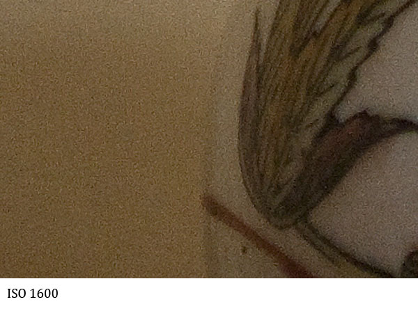
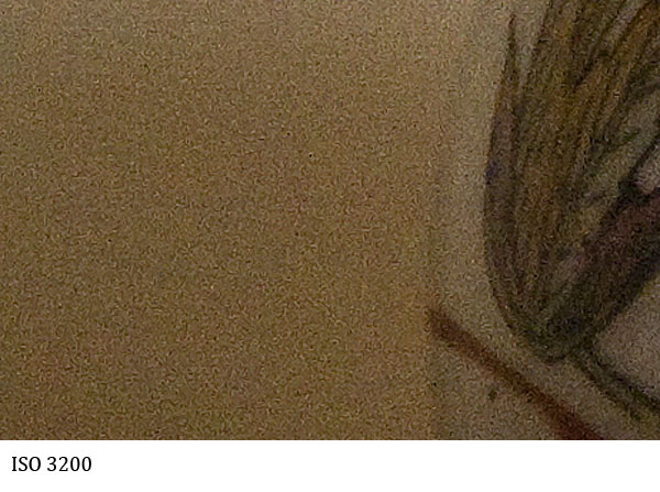
The remaining images are cropped in the area of shadow on the far left at 100% so that the levels of noise can be compared.

In summary the level of noise seen even at ISO 200 is visible  when compared to ISO 100 but tolerant up to ISO 400. There then seems to be a significant jump at ISO 800 / 1000 and after that serious deterioration and increase in the level of noise. It would therefore be conclusive that to obtain images with a reasonable level of noise my camera needs to be below ISO 800 where possible.


Monday, 19 September 2011

Exercise: Highlight Clipping


In this exercise we are to explore the digital artefact of Highlight Clipping. This is where the brightest parts of the image exceed the cameras ability to record values (>255 where 255 is pure white or RGB 255,255,255). This causes a non graduated block of pure white which will look unattractive to the human eye.

For this exercise we are to use the highlight clipping warning on the camera and take an image where the clipping just starts. Then take another image at +1 f-stop and then another 3 degreasing by 1 stop each time. We are to note the effects of highlight clipping in the image and any effects on colour casts or saturation. Finally if taking images in RAW we are to experiment with the 'Recovery' slider in the RAW conversion process to see its effects.

The first image below was taken where the clipping was just starting in the sky and the red flowers.


The following two images are taken +1 stop at f4, the second is a screen shot of the RAW conversion showing the extensive clipping in red.


The flowers look redder but this is where clipping has occurred. It can been seen clearly that the images are washed out or faded and that the sky is completely burnt out leaving a border-less wash of white. Experimenting with the recovering slide even at 100% did not recover the sky. Whereas using this tool for the standard and -1 stop image showed great results.

The following images were taken at higher f-stops (less light through the aperture) and have not shown any significant clipping at all. It can also been seen that the skies blue saturation is visible and the red flowers more intense due to higher saturation.


Zooming into the red flowers on the left it can be seen that the red flowers are washed out and the pink flowers clipped with no distinction or border within the petals or background. The image at -1 stop has this area of the image perfectly exposed with ideal saturation and distinction.


This part of the course is leading us into the area of dynamic range and the capability for a camera to accurately record images with high contrast such as the one in this example. On many occasions it may not be possible to do this but with the use of the RAW conversion process, checking the highlight warning at the time of the exposure and perhaps using graduated filters this can be overcome to some extent.

Thursday, 15 September 2011

Reading material

As part of this course I have been reading two books. The first is actually Diane Arbus' unofficial biography by Patricia Bosworth. I wanted to see what went into the mind of such a talented and creative photographer who clearly had both highs and lows in her life. Here older brother,  Howard Nemerov, became the very successful American poet and writer is also mentioned in great detail also along with their deep childhood relationship. Born into new money shortly after the depression their lives as children seemed quite challenging. I have now reached the part where Diane is moving away from art and music and is starting to experiment with the camera, and forming ideas of capturing people that seem out of place.Diane has also met Alan Arbus, and it about to marry. I am not sure how this will help but I am hoping that something will rub off.


The second book is the Photographer's Eye by Michael Freeman, the author of the TAOP and DPP courses. This is part of the recommended reading in the course notes. At first I was not sure about the content of this book as the first couple of chapters are really just a review of the TAOP course which I have now completed. However ploughing on I think that this is a good book to underpin the knowledge gained so far and it seems in some areas to go much deeper than TAOP and Freeman is very good at explaining things in simple terms with very good illustrations so I will finish this one off soon and use it as reference.

Assignment 1 is now finished and I will continue this weekend with the next section.....

Monday, 5 September 2011

Exercise: Editing

In this exercise we are tasked with taking at least 50 images of the same theme or location. I chose Airbourne, the Eastbourne Airshow. I had never taken any images of an airshow before so this was quite a challenge, so I made sure I took lots of images, 144 in total. Most of these were of the airplanes, but I also wanted to catch some of the crowds as it became clear that the shots of planes in the sky had little reference to an airshow.

Step One - The technical Edit

I also found that I had to use my largest zoom lens and panning on fast jets buzzing over the pier was also quite tricky, even with image stabilizers and  servo focus, this led to an amazing 75 of 144 images being immediately rejected. I marked these in Adobe Bridge as RED (reject). I changed the default colours and names in Bridge so that they mean more to me for EDITING under workflow.

Step Two - The Selects

Adobe Bridge also has a great filter so I can only view the labels I want to. At this stage I filtered out the rejects and labelled the remaining images as selects (YELLOW). Then going through each one I tagged those as REJECTS that were not creative or part of a series where there was a better image in the sequence. This now left me with the SELECTS tagged YELLOW.

Step Three - The First Selects

Again using Bridge to only display the Selects I then changed the images I really liked with a First Select Label or GREEN. This I found harder as it needed a good memory on what you have selected and viewed, especially out of 69 selects. This first pass has split the selects into 26 First selects and 43 selects. Now I am taking a break before continuing.....

Step Four - The Review

Reviewing the decisions made so far was not that hard. I did promote a couple of First Selects from selects but essentially everything stayed much the same.

Step Five - The final choice

This was hard. I still had 27 images to choose from but I knew I wanted one of the planes and one of people as previously mentioned to give it reference. I only had one final select of both plane and people and although not a bad image it wasn't really up to scratch so I was left with having to make individual choices.

Selecting the people shot was straight forward as there were not that many to choose from. Here is what I chose:


Selecting the plane shot was much harder. I had good shots of the Red Arrows, Spitfires and Lancasters grouped together and individual, Tornado Jets showing off their bellies, and an F16 ejecting star bursts in a vertical ascent. In the end I chose the following image as it shows great contrast of the new and the old, an Old American WWII Curtiss P40 Warhawk and a relatively modern F16 fighter, two planes for the price of one.....


The final images were cropped and slightly adjusted for tone in Photoshop.