The web site is now live after many hours of struggling with html and some javascript...... I am not entirely happy with the splash page and may change this as and when I get more topics to present. For now I have uploaded some of the Art of Photography images just to demonstrate some varying images to see how things work.
I think I have met all of my objectives. It was written in basic html using a jquery plug-in called ad-gallery that was slightly modified. This gave me a slideshow, gallery thumbs and a nice navigation engine to display the images, image descriptions and it also pre-loads images so I probably could go for bigger image sizes but at this point I have left them at a medium screen resolution that I think is fine.
Web site address: www.nathanadams.me.uk
Monday, 16 July 2012

Saturday, 7 July 2012
Web Site Design
As part of section 5 we are tasked with building a web site to display our portfolio, so I have been reviewing various photographers' web sites to get ideas of what looks good and what doesn't. The following is what I am planning:

- Clean classic design, minimal no fuss. The site should concentrate on the images.
- White (or near white) background. Use of grey text [#807e7e and #999999] seems best
- Slide show would be nice
- Menus for different projects
- Contact information
- Film strip
- Optional description of the project / image
- Would be nice if when re-size the browser the web site was not affected or moved with the resizing. A lot of sites seen to fail on this point.
- I don't like pages that have the viewed imaged fading in and the background lost, this is too messy for my liking and too animated. Examples of this are Thickbox and lightbox.
- What size are my images going to be, the viewing area should accommodate for both portrait and landscape, if pre loading of images can be done then size can be bigger, perhaps around 350k for JPEGS or 400 x 600 px as this is the same ratio as my camera so no cropping.
- Flash is a little above me and I am told will be retired soon with html 5 taking off. So it is just Javascript for now.
I have found some javascript / jquery called ad-gallery which is free to use so I am hoping to use this. Although this part of the project is optional I really feel that it will be worth the effort as I am sure this site will evolve over the coming years as I progress my courses.
Here is my first attempt at a logo, drawn in Photoshop.....the fonts I have chosen are Corbel and Verdana, I actually compressed my name a little and obviously expanded out the character spacing for the word ' photography'. However as these fonts may not be installed in my viewers computers I think I will have to use a more standard font such as arial for the site's text so that every viewer receives the same experience.

Assignment 4: Feedback
Overall I was very pleased with the feedback I have received for this assignment. I did struggle more than usual over this and although the original idea was reasonable I found it hard to put into practice. However help from my tutor in replacing the lenses with mirrored lenses proved to be the winner and saved the project.
The rider placed in the lenses was blurred using motion blur as I found him too sharp to be real, comments received back suggested that I over did this and that the reflection should have been sharper. I did try this out before submission and thought that it was too unreal, and made too much of a focus on the reflection in the lenses. I do however agree that the image in the lenses needs attention but at my level I am at a loss as to what it really needs.
The image was a composite of three images, the main rider, the rider in the lenses and a pair of reflective glasses.
.jpg)
The rider placed in the lenses was blurred using motion blur as I found him too sharp to be real, comments received back suggested that I over did this and that the reflection should have been sharper. I did try this out before submission and thought that it was too unreal, and made too much of a focus on the reflection in the lenses. I do however agree that the image in the lenses needs attention but at my level I am at a loss as to what it really needs.
The image was a composite of three images, the main rider, the rider in the lenses and a pair of reflective glasses.
.jpg)
Tuesday, 3 July 2012
More on Enhancement
Whilst researching photographers' web sites as preparation work for the next chapter I came across my namesake at nathanadamsphotography.com. This web site is really very good, well thought out and presented, though perhaps too busy for my liking; I am looking for something more timeless or simple. In any case I have found some code that I think will do for my web site and I hope to be able to keep this new web site throughout my OCA courses and build upon it as my portfolio.
I did find one image on this particular site that was crying out for adjustment and is a much better example of my image used for enhancement. So I thought I would document the process here in my learning log for future reference. First here is the original:

The first thing that struck me was that the eyes are quite dark, this is added to by a blue / cyan cast over the image. Perhaps this was taken in shade and needs the correct white balance. As I only have a JPEG I adjusted the colour balance to shift the blue / yellow to yellow and the cyan / red to red, leaving the magenta / green slider alone. This seems to warm up the image and bring out the blonde hair. I then made a feathered selection around the eyes and boosted the levels, then dodged the pupils further to bring them out.
Finally, I sharpened the image for the screen but on a separate layer so that only the eyes and hair were sharpened leaving the skin as is. I hope Nathan does not mind me using his image as a learning aid, its a great shot and the model has such lovely eyes its a shame not to make the most of them.

I did find one image on this particular site that was crying out for adjustment and is a much better example of my image used for enhancement. So I thought I would document the process here in my learning log for future reference. First here is the original:

The first thing that struck me was that the eyes are quite dark, this is added to by a blue / cyan cast over the image. Perhaps this was taken in shade and needs the correct white balance. As I only have a JPEG I adjusted the colour balance to shift the blue / yellow to yellow and the cyan / red to red, leaving the magenta / green slider alone. This seems to warm up the image and bring out the blonde hair. I then made a feathered selection around the eyes and boosted the levels, then dodged the pupils further to bring them out.
Finally, I sharpened the image for the screen but on a separate layer so that only the eyes and hair were sharpened leaving the skin as is. I hope Nathan does not mind me using his image as a learning aid, its a great shot and the model has such lovely eyes its a shame not to make the most of them.

Sunday, 24 June 2012
HDR
Submission for Assignment 4 is now complete. For this first time I have posted this on Facebook to judge peoples reactions to the Real or Fake image, lets see what comes back.
In the meanwhile I am now a convert to HDR and Photomatix. I have seen tutorials on HDR and have combined two or three images together manually in Photoshop but never used custom software. I found that the process in CS5 works but not great, what I like about Photomatix is the speed and clarity of the composition. Adding the tone maps really brings the image to life. At this point all I can see is myself doing is HDR images!
Thankfully educational discount is 75% off so this piece for software was a steal to buy and I have used it for two of the images already for the final assignment 5. I hope these are well received. Would post now but it will ruin the assignment......
This as it happens is almost complete and I feel that I have done all I can with the images, perhaps I might just buzz these around Facebook too to get any feedback. A few of my friends are very good photographers so its got to be worth a bash!
In the meanwhile I am now a convert to HDR and Photomatix. I have seen tutorials on HDR and have combined two or three images together manually in Photoshop but never used custom software. I found that the process in CS5 works but not great, what I like about Photomatix is the speed and clarity of the composition. Adding the tone maps really brings the image to life. At this point all I can see is myself doing is HDR images!
Thankfully educational discount is 75% off so this piece for software was a steal to buy and I have used it for two of the images already for the final assignment 5. I hope these are well received. Would post now but it will ruin the assignment......
This as it happens is almost complete and I feel that I have done all I can with the images, perhaps I might just buzz these around Facebook too to get any feedback. A few of my friends are very good photographers so its got to be worth a bash!
Monday, 18 June 2012
Exercise: Alteration
Well, we are leading up to making more and more changes to images, and this exercise is about replacing a part of an image with areas around it to remove it completely from the scene. This form of manipulation could well be considered unethical but in some cases it may be necessary where a moment in time can not be repeated for example of where any potential angle or viewpoint does not remove an ugly artefact.
This is a reasonable good wedding photograph showing the happy couple but separated by someone in the background. Although the depth of field is blurring it out this is a large distraction and one that makes the image unacceptable.

 The area around the gentleman in the background is a tree (bark) which is a good cloning material as it has an unstructured pattern that can easily be blended. First of all I made a careful selection of this chap and feathered it by 3.5px as shown left. This is to make sure that I only clone within the selection and not on to the face of the groom.
Using the cone tool I select an area of bark and carefully clone this into the selection in several passes until all of the selection is made. There is a small piece not selected just above the shoulder of the groom, I did not select this in the cloning pass as there are some flowers protruding that I did not want to clone over. In a separate selection of this area I applied a hue / saturation adjustment altering the saturation, lightness and hue to match the background, this had very little affect on the hue of the flowers hence masking out the dark blue of the man's shirt.The final image once complete is below.

I think this is a reasonable removal of the gentleman and I can't really see an remnants of alteration, certainly not at this resolution. Perhaps there is a little but it certainly has brought the image back to life. The lady to the right is not ideal but not as bad as the chap in between the happy couple. Ethically is this correct? No I should have asked the gentleman to move, that would have saved the shot, but I do accept that there are scenes and situations that would warrant minor removals where absolutely necessary....What the eye doesn't see the heart doesn't grieve over? Perhaps.....
This is a reasonable good wedding photograph showing the happy couple but separated by someone in the background. Although the depth of field is blurring it out this is a large distraction and one that makes the image unacceptable.


Using the cone tool I select an area of bark and carefully clone this into the selection in several passes until all of the selection is made. There is a small piece not selected just above the shoulder of the groom, I did not select this in the cloning pass as there are some flowers protruding that I did not want to clone over. In a separate selection of this area I applied a hue / saturation adjustment altering the saturation, lightness and hue to match the background, this had very little affect on the hue of the flowers hence masking out the dark blue of the man's shirt.The final image once complete is below.

I think this is a reasonable removal of the gentleman and I can't really see an remnants of alteration, certainly not at this resolution. Perhaps there is a little but it certainly has brought the image back to life. The lady to the right is not ideal but not as bad as the chap in between the happy couple. Ethically is this correct? No I should have asked the gentleman to move, that would have saved the shot, but I do accept that there are scenes and situations that would warrant minor removals where absolutely necessary....What the eye doesn't see the heart doesn't grieve over? Perhaps.....
Exercise: Addition
This again is a two staged exercise challenging the dynamic range of the camera and learning how to merge either two exposures of the same image (taken within seconds) into a single image or by replacing part of an image that may be overexposed with another image
For the first part I took two images of a scene on a tripod so that the images would be exactly the same, but altering the exposure (shutter speed) so that the first image has the foreground perfectly exposed (1/5 sec) and the second the sky perfectly exposed (1/80 sec) both images were taken at f13 so that the depth of field remained constant.
Not surprisingly the dynamic range of the camera is well surpassed and either the sky is completely burnt out or the foreground too underexposed.


Using Photoshop I copied the darker image onto a new layer on the foreground exposure and applied a standard mask. The notes suggest using the eraser tool to remove under exposed parts to reveal the foreground exposure underneath, and while this is a good way to do things I prefer to use masks as they are non-destructive; any errors can simply be altered by painting in either black (hide) or white (show) with varying brush opacities to blend in the two images.


So I first added a gradient from white to back (top to bottom) in the mask, this revealed an almost perfect image with no selection or erasing. As the horizon in my image is not flat this left some of the bushes too dark, this came from the darker exposure of the sky. By selecting a soft brush with an opacity of 20 I painted over these areas so that they blended in to produce the following composite image. I feel that this has worked well and any join is invisible due to the blend of the mask as seen from the layers menu above.
The second task is to replace the sky completely with a second image from a different scene. I used the same landscape image but this time replacing the sky with the following image. I chose this image of the 'sky' as the sun was shining from the left to the right as it is in the original landscape.

I used a similar method as before using a layer mask to blend in the new image into the existing image to produce the following. Whilst I think that this is acceptable and not much to compare with from the first image composition I feel that this one is not quite as believable.
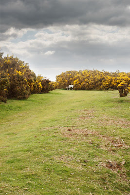
For the first part I took two images of a scene on a tripod so that the images would be exactly the same, but altering the exposure (shutter speed) so that the first image has the foreground perfectly exposed (1/5 sec) and the second the sky perfectly exposed (1/80 sec) both images were taken at f13 so that the depth of field remained constant.
Not surprisingly the dynamic range of the camera is well surpassed and either the sky is completely burnt out or the foreground too underexposed.


Using Photoshop I copied the darker image onto a new layer on the foreground exposure and applied a standard mask. The notes suggest using the eraser tool to remove under exposed parts to reveal the foreground exposure underneath, and while this is a good way to do things I prefer to use masks as they are non-destructive; any errors can simply be altered by painting in either black (hide) or white (show) with varying brush opacities to blend in the two images.


So I first added a gradient from white to back (top to bottom) in the mask, this revealed an almost perfect image with no selection or erasing. As the horizon in my image is not flat this left some of the bushes too dark, this came from the darker exposure of the sky. By selecting a soft brush with an opacity of 20 I painted over these areas so that they blended in to produce the following composite image. I feel that this has worked well and any join is invisible due to the blend of the mask as seen from the layers menu above.
The second task is to replace the sky completely with a second image from a different scene. I used the same landscape image but this time replacing the sky with the following image. I chose this image of the 'sky' as the sun was shining from the left to the right as it is in the original landscape.

I used a similar method as before using a layer mask to blend in the new image into the existing image to produce the following. Whilst I think that this is acceptable and not much to compare with from the first image composition I feel that this one is not quite as believable.

Subscribe to:
Posts (Atom)