Sunday, 25 September 2011

Exercise: Your tolerance for noise

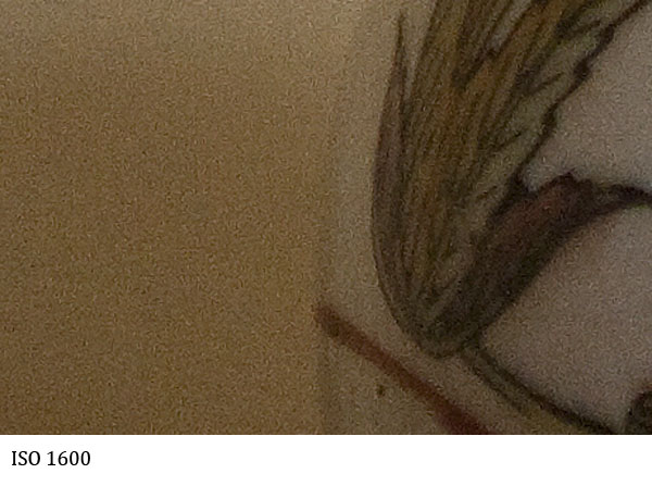
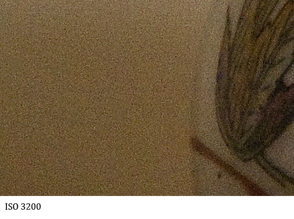
It is evident on a digital camera that noise appears mainly in the shadow areas where there is less sampling, and therefore more 'made up' pixels known as noise appear. In this exercise we are to note the results of taking pictures in low light conditions with a range of ISO values to find our own tolerance for noise. The subject is to be indoors during the day (low light) and have a plain or texture-less area partly in shadow. This will accentuate the noise and make it more visible.

My camera has ISO settings ranging from 100 to 3200, the results are quite staggering when comparing one end to the other. For this exercise I have taken each image and then highlighted the left ball where the plain background wall is partly in shadow. All images were taken on a tripod at f/2.8 with aperture priority so that the depth of field remains constant throughout.


The remaining images are cropped in the area of shadow on the far left at 100% so that the levels of noise can be compared.

In summary the level of noise seen even at ISO 200 is visible  when compared to ISO 100 but tolerant up to ISO 400. There then seems to be a significant jump at ISO 800 / 1000 and after that serious deterioration and increase in the level of noise. It would therefore be conclusive that to obtain images with a reasonable level of noise my camera needs to be below ISO 800 where possible.


Monday, 19 September 2011

Exercise: Highlight Clipping


In this exercise we are to explore the digital artefact of Highlight Clipping. This is where the brightest parts of the image exceed the cameras ability to record values (>255 where 255 is pure white or RGB 255,255,255). This causes a non graduated block of pure white which will look unattractive to the human eye.

For this exercise we are to use the highlight clipping warning on the camera and take an image where the clipping just starts. Then take another image at +1 f-stop and then another 3 degreasing by 1 stop each time. We are to note the effects of highlight clipping in the image and any effects on colour casts or saturation. Finally if taking images in RAW we are to experiment with the 'Recovery' slider in the RAW conversion process to see its effects.

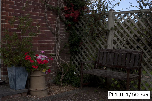
The first image below was taken where the clipping was just starting in the sky and the red flowers.


The following two images are taken +1 stop at f4, the second is a screen shot of the RAW conversion showing the extensive clipping in red.


The flowers look redder but this is where clipping has occurred. It can been seen clearly that the images are washed out or faded and that the sky is completely burnt out leaving a border-less wash of white. Experimenting with the recovering slide even at 100% did not recover the sky. Whereas using this tool for the standard and -1 stop image showed great results.

The following images were taken at higher f-stops (less light through the aperture) and have not shown any significant clipping at all. It can also been seen that the skies blue saturation is visible and the red flowers more intense due to higher saturation.


Zooming into the red flowers on the left it can be seen that the red flowers are washed out and the pink flowers clipped with no distinction or border within the petals or background. The image at -1 stop has this area of the image perfectly exposed with ideal saturation and distinction.


This part of the course is leading us into the area of dynamic range and the capability for a camera to accurately record images with high contrast such as the one in this example. On many occasions it may not be possible to do this but with the use of the RAW conversion process, checking the highlight warning at the time of the exposure and perhaps using graduated filters this can be overcome to some extent.

Thursday, 15 September 2011

Reading material

As part of this course I have been reading two books. The first is actually Diane Arbus' unofficial biography by Patricia Bosworth. I wanted to see what went into the mind of such a talented and creative photographer who clearly had both highs and lows in her life. Here older brother,  Howard Nemerov, became the very successful American poet and writer is also mentioned in great detail also along with their deep childhood relationship. Born into new money shortly after the depression their lives as children seemed quite challenging. I have now reached the part where Diane is moving away from art and music and is starting to experiment with the camera, and forming ideas of capturing people that seem out of place.Diane has also met Alan Arbus, and it about to marry. I am not sure how this will help but I am hoping that something will rub off.


The second book is the Photographer's Eye by Michael Freeman, the author of the TAOP and DPP courses. This is part of the recommended reading in the course notes. At first I was not sure about the content of this book as the first couple of chapters are really just a review of the TAOP course which I have now completed. However ploughing on I think that this is a good book to underpin the knowledge gained so far and it seems in some areas to go much deeper than TAOP and Freeman is very good at explaining things in simple terms with very good illustrations so I will finish this one off soon and use it as reference.

Assignment 1 is now finished and I will continue this weekend with the next section.....

Monday, 5 September 2011

Exercise: Editing

In this exercise we are tasked with taking at least 50 images of the same theme or location. I chose Airbourne, the Eastbourne Airshow. I had never taken any images of an airshow before so this was quite a challenge, so I made sure I took lots of images, 144 in total. Most of these were of the airplanes, but I also wanted to catch some of the crowds as it became clear that the shots of planes in the sky had little reference to an airshow.

Step One - The technical Edit

I also found that I had to use my largest zoom lens and panning on fast jets buzzing over the pier was also quite tricky, even with image stabilizers and  servo focus, this led to an amazing 75 of 144 images being immediately rejected. I marked these in Adobe Bridge as RED (reject). I changed the default colours and names in Bridge so that they mean more to me for EDITING under workflow.

Step Two - The Selects

Adobe Bridge also has a great filter so I can only view the labels I want to. At this stage I filtered out the rejects and labelled the remaining images as selects (YELLOW). Then going through each one I tagged those as REJECTS that were not creative or part of a series where there was a better image in the sequence. This now left me with the SELECTS tagged YELLOW.

Step Three - The First Selects

Again using Bridge to only display the Selects I then changed the images I really liked with a First Select Label or GREEN. This I found harder as it needed a good memory on what you have selected and viewed, especially out of 69 selects. This first pass has split the selects into 26 First selects and 43 selects. Now I am taking a break before continuing.....

Step Four - The Review

Reviewing the decisions made so far was not that hard. I did promote a couple of First Selects from selects but essentially everything stayed much the same.

Step Five - The final choice

This was hard. I still had 27 images to choose from but I knew I wanted one of the planes and one of people as previously mentioned to give it reference. I only had one final select of both plane and people and although not a bad image it wasn't really up to scratch so I was left with having to make individual choices.

Selecting the people shot was straight forward as there were not that many to choose from. Here is what I chose:


Selecting the plane shot was much harder. I had good shots of the Red Arrows, Spitfires and Lancasters grouped together and individual, Tornado Jets showing off their bellies, and an F16 ejecting star bursts in a vertical ascent. In the end I chose the following image as it shows great contrast of the new and the old, an Old American WWII Curtiss P40 Warhawk and a relatively modern F16 fighter, two planes for the price of one.....


The final images were cropped and slightly adjusted for tone in Photoshop.


Tuesday, 30 August 2011

Exercise: Histogram

This is an interesting exercise in exploring the histogram and how it relates to exposure. For this exercise we are to choose three subjects, one with low contrast (flat or no dynamic range with the histogram grouped in one area) an average contrast, and high contrast ( histogram spreading over the entire graph). We are also to take 3 images of each subject at -1,0 and +1 f-stops compensation and note the affects of the histogram and any highlight or shadow clipping warnings.

I actually learnt quite a bit here as some of my subjects were not as contrasting as I thought they would be and visa versa, I may be confusing contrast and how this is displayed on the histogram.

I have always used the histogram on the camera for checking images, the ideal always being a good contrast with pixels from far left to right without clipping. In photoshop I also use it with 'levels' to increase or broaden the pixels to the left or right by moving in the sliders. This boosts the pixels in these areas.

The first set of images I thought would be higher contrasts as they have white flowers, however the histogram shows that the majority of pixels are in the shadows, perhaps this is where the camera is compensating for a high contrast image. In both the 0 and -1 exposures the shadow clipping warnings were displayed as also seen by the big spike on the left of the histogram. Increasing the compensation to +1 removed this but added a highlight warning, however this has led to a more distributed histogram although lacking in the 'middle'.


The next set of images I thought would initially be flatter, but they are actually average contrasting. In this set the shadow warnings did not appear, though in the +1 exposure a slight highlight clipping was shown, this can also be seen in the histogram as an overexposed image. Again the shift in the histogram can be seen from left to right with greater exposure. In this set the zero exposure has the best histogram more centrally distributed.


The final set of high contrasting images are of an office block with lots of black and white making the most contrasting image I could find. These images were taken on a sunny day and this has led to the shadows being less intense, however this does make for some interesting histograms.

I also left the ISO at 1000 by mistake, this has led to grainier images that expected.

In this set I actually prefer the contrasts of the -1 f-stop exposure. It also has the highest dynamic range and the only one to show both shadow and highlight clipping. The middle image is fine but the +1 exposure was too overexposed with a lot of highlight clipping warnings, all to the left of the image and little or no shadow. all 3 histograms are very 'spiky' could this be caused by the midday sun and the high contrasting subject?


Tuesday, 23 August 2011

Exercise: Your own workflow 2

This exercise is similar to the previous exercise though the subject matter is unstructured and open in terms of time generating an unpredictable number of images. This leads to a slightly different workflow, especially in the selection process. I chose street photography on a visit to London, the number of images taken was around 60 but these were reduced on the day by deleting poor images using the camera's preview window. This is itself is a variation to the previous workflow....
The workflow consisted of:

Planning: Capture classic street images of London, visit Convent garden, capture street performers, crowds, people in situations.....

Preparation: batteries charged, memory cards wiped, selected wide angle lens with polarising filter. Flash batteries checked.

Shooting: check images and re-shoot or delete as appropriate. Checking done on tube etc. Looking for over-exposed, under exposed, blurred images.

Download images to negatives directory under a subdirectory of 'Your own workflow 2'

Made selection of 'selects' and then chose the best from these., after having a break and reviewing.

Finally edited final selects for colour, contrast and sharpness. Saved to JPEGS and uploaded to blog.

Conclusions:

This is subtlety different to the first exercise. I found that the workflow varies in the time allowed to refine images on the job, this leads to a lower number making the processing stage quicker. The choice of subject also leads to images that you had no idea you would capture, this in turns makes the selection process longer as there will be more varied images compared to that of the firs workflow where there may be many images of the same subject. Planning and processing did not vary much if any thing at all.

I am not sure if it is relevant but I also find choosing the final selects harder!!!!


Wednesday, 17 August 2011

Exercise1: Your own workflow 1


In this exercise we are tasked with devising our own workflow for a specific short assignment. It is suggested using a portrait session which is limited in time. I however had an opportunity of taking some images at a small local festival, and I would only be there for one pint so time in this case was certainly limited.

From these time limited images we are to select a final two encompassing our entire workflow.

Digital workflow is not new to me and I took on a lot of advise a while ago from a digital camera magazine on this very topic, though this was more concerned with organization of files it did include many aspects of workflow.

For this exercise the workflow devised was:

Preparation:

Batteries charged, flash cards cleared of old images, use of mid range zoom lens, camera set to 100 ISO and auto white balance.

Images to capture the essence of a small music festival, people, tents, music, dance, colour etc.

Shooting images

Processing

Upload images to PC in raw format (note the directory I use automatically syncs a backup copy to another disk for security). I used the Adobe Bridge utility to automatically rename the images to the event and store them in a directory called ‘digital negatives>oca>dpp>part one>festival’, keeping the files in an ordered place helps me find them in the future.

Use Adobe RAW converter to weed out poor images, or out of focus, blurred etc., mark these as UNSELECTED. These will be deleted later from the hard disk.

Select all possibles, and mark the ones I like as RED, potentials as YELLOW, noting that these may look OK if cropped or converted to grayscale.


Process the final two images, this may include cropping, curves, colour [ the camera makes no adjustments], save as JPEG.

Further crop image to a smaller size suitable for the blog and upload.

I found that this workflow works well for me, although I didn’t capture as many images on the day I would have liked the overall process has helped me to think about preparation and improving workflow to help be more efficient in getting results. I also need to devise a plan to archive off the images that are not suitable, perhaps just to a DVD and leave only the Green images on the disk, with the amber archived and the reds deleted entirely. My hard disk is getting full……

The final approved two images, showing movement, people and colour....