Monday, 18 June 2012

Exercise: Enhancement

This exercise is finding a way to improve a portrait shot taken in shade.This involves a two stage process, firstly by dodging or increasing the lightness of the face, and then secondly enhancing the eyes by further dodging and increasing saturation.

My original shot was not too bad though it is lacking in punch and vibrancy.


I created a new levels adjustment layer and filled the mask with 100% black; this effectively blocks out all changes to the adjustment. I then boosted the levels significantly and then using a white soft headed brush of 50px I painted into the mask revealing an overexposed face. I preferred to do the selection this way as it is easy to see the effect on the image and is easily corrected with a black brush. Once I had the right selection in the mask I then adjusted the levels to the correct value to produce a lightened face that is hopefully realistic.


The final section is about boosting the eyes. For this I repeated the levels adjustment on a new layer to boost the whiteness in the eyes. I have often seen this well over-cooked in cheaper magazines, almost looking like the eyes have been tipexed in, so I was careful to not over do this. Finally I repeated the selection and used a hue / saturation adjustment layer just to boost the saturation of the eyes slightly.

Overall this is a good improvement to the original image making the eyes much more piercing and drawing. It is possible on this blog to click on the first image to bring up a slide show moving between images with the cursor keys, it is easier to see the changes in this mode.


Monday, 28 May 2012

Exercise: Improvement or interpretation

This exercise was all about making an improvement to an image by selecting parts of it to work with emphasising areas that require more focus.

For this exercise we are to take an image of someone in part shade and selecting them and make an enhancement such as a levels or curves adjustment. For my image I also chose a bright background. Normally you would use a fill flash for this type of photography and I have later shown how the raw conversion 'fill light' has helped.

Here is the original image, as seen the subject is in shade which does not produce a pleasing image.


I then used the lasso tool to select around the subject, then refining it with shift (add) and alt (minus) keys to get as good a selection as possible. I find that a poor selection is obvious when boosting part of a high contrasting image. After saving the selection I then feathered the selection by 20px.

Using the levels adjustment I then brought in the right hand slider to meet the edge of the histogram which has produced the following, this I feel is a good improvement, that is not unrealistic.


Pushing the levels further produces an image that I think has too much manipulation and does not work. Perhaps adding more contrast and saturation may help but that would also darken the selection as well.


Finally, using the raw converter and the fill light slider at 53 produced this image. This is remarkably similar to the first version that has been adjusted with a selection, but the raw conversion has done this with no selection!


We'll take Manhatten

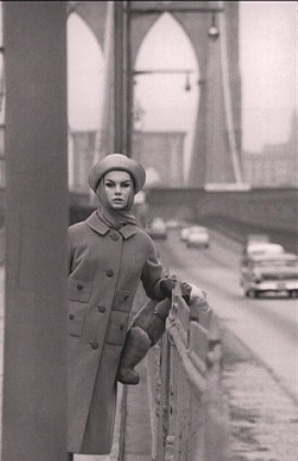
Last night I watched an excellent fact based drama about a young David Bailey on shoot for Vougue with his girlfriend / model Jean Shrimpton in 1962

http://www.bbc.co.uk/programmes/b01b674s

The programme really showed off Bailey's attitude to rejecting the norm', almost sticking two fingers up at tradition and re-writing the rule book for fashion photography. He saw a more youthful vibrant need for change, with a new post war generation that demanded a new identity and he gave that to them.

The images he captured were not just about fashion, but capturing the time and place, itself giving a context of belonging. Traditional framed images were now a thing of the past.

He even rejected the requirement to use a full frame camera on a tripod, favouring a more agile 35mm Pentax. 'Grainier' was deemed to be more refreshing.

The images that were recreated in the drama were absolutely to die for. If you watch nothing else then just look at the end credits and see the following...... These are Bailey's originals producing fresh vibrant images that are almost timeless. I particularly like the image with the puddle, great foresight, and the 'Twist' image with so much going on but yet in perfect balance. How does he see all of this? The 'Teddy Bear' theme throughout also adds a great connection between images....


Monday, 30 April 2012

The Start of the Final Assignment

I have yet to write up all of the exercises for this part of the module and yet to take any images for the assignment, although I have some ideas, yet I have found time to start taking images for the final assignment.....

My initial remit that I have discussed with my tutor is to take images of abandoned or derelict buildings. The first problem I have is finding suitable and interesting buildings. As a keen cyclist I do get to see many sites that most would whiz by in a car and miss, and this has led me to three of my subjects. I hope to get between 3 or 4 images per site, this is my first challenge. The cyclist in me has ideas for the next assignment which I will leave or now.

My tutor suggested I visit these building at different times of the day or in varying weather conditions and this is excellent advise to get a more varied set of images. Darkened skies perhaps, or a setting sun for example. Rain too may show the neglect for a building left to stand by itself.

I want to get images that shout out decay, abandonment, rot, loneliness, help,  perhaps crying out for the old times of a past when this building was cared for, lived in or used productively. If I can find some evidence of life before the abandonment set in today that would be one of my main goals achieved.

I have been checking the weather forecast in the area of my main interest and last early evening it was ideal conditions for what I was looking for, so I headed off to Horsebridge Mill.

The sun was setting lighting up the main brick tower so I concentrated on this side of the building, wading through mud and sodden ground. The water still flows through the mill creating a very relaxing sound that has not been muted over the years. With the amount of rain lately this has almost caused the banks to burst; I think I have one or two possibles from this angle.

I then concentrated on the other side of the building, walking around to the old water wheel that stands motionless, and then on to the front of the building that is weathered and worn, paint peeling off the brickwork, doors and windows smashed and boarded.

I was surprised with the fading light how different the images are from the sunny side to the dark side. I have yet to look at most of them but one took my eye and I have spent a good hour or even two on processing it. I hope it is well received. I think it will be hard to better.

My only regrets are that the mill is such a good subject that I will find it hard to get images as good as these from my other buildings. I do not think I could get 10 images from just this one, but I will leave that idea in my back pocket just in case.

Saturday, 28 April 2012

Exercise: Correction

In this exercise we are looking at correcting artefacts included in an image that should not be there, typically those caused by flaws in the camera equipment.Two that are looked at in detail are dust spots on the camera's sensor and lens flare.

I try to keep the sensor clean, especially when I start to notice dust spots, more noticeable on solid colours such as the sky on a clear day. Finding them in a mix of colours is a lot harder.

Looking back I had problems in finding an old image with such spots, which I suppose is good, but he is one with a minor spot shown in the white square, though not easy to see at this resolution.


To fix this is very straight forward using the spot healing brush, just select a brush size slightly larger that the spot and click. I find it very hard to see any join and remnant of the original blemish.I feel that this form or alteration is valid as the spots should not be there and are introduced through flaws in the camera. Also removing them is virtually transparent to the viewer, so that the feeling of modification, will in almost all cases, not be known.

The second flaw looked at was lens flare. Again an artificial artefact but one that is a lot harder to remove. I could not find such an image in my collection, but I used photoshop to add a lens flare through  the filter menus.


Personally, I like lens flare but in some cases this may become too distracting or spoil a particular part of an image and therefore needs some treatment. As described in the notes I used the clone tool, with the mode being set to colour and darken. On my first attempt I found that I needed to reduce the opacity to around 50% as the changes were too strong, I also found that using a colour mode has changed the colour of the highest head of grass to a blue tinge. In hindsight I should have used a layer mask to make the changes, I then could have gone back and deleted the changes over the head of grass to bring back the original.

Overall the technique has been successful, but there are traces to me that are quite obvious that changes have occurred and therefore I do not feel that this is a valid editing process.Personally I feel that the lens flare should be retained, and if it cannot be removed without having obvious water marks then the image should be left as is or assigned to the bin.


Friday, 20 April 2012

Martin Parr

Documentary photography has interested me probably more than any other genre. In looking for potential topics for the final assessment I have been looking at Martin Parr [1952 - ] an English photographer noted in The Photograph [1] by Graham Clarke. He is best known for his critical work looking at life in England with an emphasis on the social awareness of an image. He has tended to break the mould a little in producing a series of images for each topic that depict a social scene around the current attitude to life. This is an interesting concept in that the images not only document the moment in time but also the social awareness of that time.

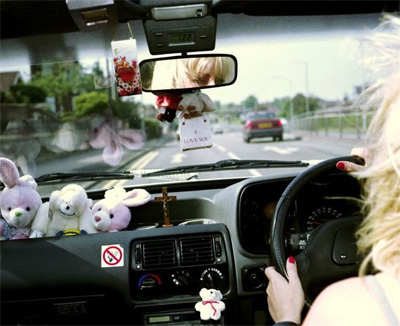
I was particularly drawn to his book A to B [2], a collaborative piece of work with film maker Nick Barker, in which Parr took images of people with their cars in the early 1990's. This is about people with their prized possession, the car, and how it is a reflection of their own persona and how the car has become part of the social status of life. Some decorate the car personally, for others it is a workspace, but in all of them the subjects seem to be enjoying the moment of being with and driving their car. There are also several shots of single women, perhaps describing an inner portrait of their own self-image or freedom. So the car is therefore no longer an instrument to get from A to B, rather a social necessity and statement of who we are.

I really like his work, it is simple, has great colour and records a past era that I can recall in my early years of motoring, but it recalls more than just memories or cars and motoring but also the social awareness of the car.....

I have decided not to try and follow Parrs work here for now, I will revisit this for People and Places as I think it will be more suited here.

Look at me, an image of glamorous motoring
The car adorned with tokens of ownership
A formal family day out in the Mercedes. I love the yawning of the small boy
I like this image in that fact that the car has a higher status in this young man's life than his girlfriend resigned to the blurry back of the image.


[1] ISBN  789-0-19-284299-8 p.71-72
[2] ISBN 0 563 36984 1      

Sunday, 15 April 2012

Reflection of last Assignment - Its been a while

I have not been able to pursue the course much lately. This is mainly down to working away, work and having to study for work related exams..... work, work work!

With only one more exam to go at work, I have found time to study the course material and take images for the exercises, so hopefully I will post this soon. In the meanwhile here are my reflective notes from the feedback received for the monochrome assignment.....

All in all it was a very pleasing and constructive response. It was commented early on that the changes and enhancements I have made to the images were subtle and perhaps not as strong as could have been made. This I found interesting as I have been trying hard to make sure the the images I take need as little processing as possible, previously I relied too much on Photoshop. Using the correct white balance and checking exposures with the histogram have helped enormously to capture better images. To try and retain this unaltered look I have probably been a bit economical with some of the sliders and I can see how and why I could make some improvements. As the course unfolds we are now being encouraged to question what is acceptable in modifying images, and my view today is that as an art form we must make the best possible image from the tools we have available, however it should not make the image unbelievable or obviously modified to too great an extent. So in the future I will push the processing a little further.

My tutor has also kindly given examples on processing a couple of my images. In these he has made one more dramatic and in the other drawn out more detail. On reflection I should have spent more time processing the images and not trying to have them looking too natural. The one image I did increase contrast significantly and dodged and burned (Lobster Pots) received good feedback in respect to the tonal range.

I was also pleased that the BMX and Abandoned images were well received as these were my favourites. Notes to self, pay attention to detail and show more in the Blog and Assignments on experimenting with different techniques. I do this all the time but do not record it.

Here are the images for anyone interested! The theme was the coastline of Eastbourne, or just outside.